HAKIB2B · Brand Growth - Digital Experience
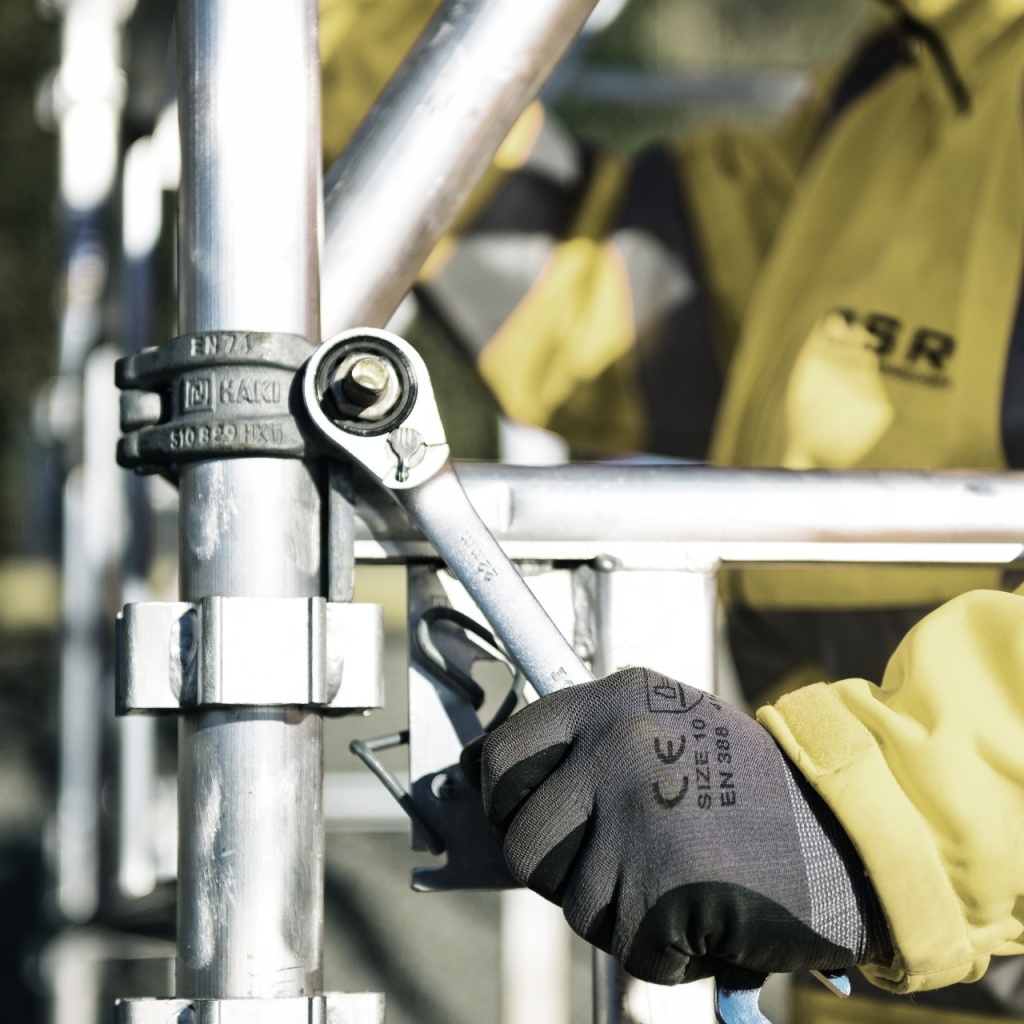
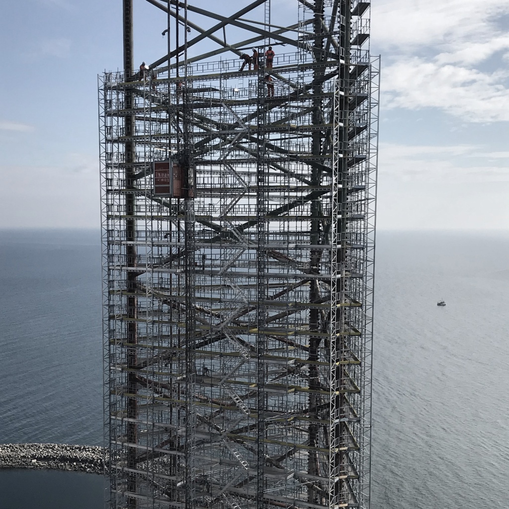
HAKI is one of the world’s leading supplier of Safe Access Solutions. The company, from the village of Sibbhult, exists to make life safer for people working in challenging environments, and has been an established actor in the scaffolding market for over 60 years. Today, HAKI has reached a global presence with business up and running in 15 countries.
The work we create
Safe access solutions for any situation
Through continuous innovation and optimisation, HAKI creates the necessary conditions for safe work environments on a global stage. To effectively communicate that core proposition but also further strengthen its market position, HAKI asked us to evaluate its brand, visual language, and accusation strategy.
Building a solid foundation
Our first order of action was to build a solid foundation for the HAKI brand to stand on. We created a brand strategy that outlined who HAKI are, what they do, what makes them stand out, what they believe in, and what they aspire to become in the future.
The brand strategy gave us the structure we needed as we shifted our focus to brand tonality and visual identity.
Brand guidelines
We wanted to give HAKI a brand identity that felt true to the innovative, modern company that it is today, while still honouring its heritage. To accomplish that, we chose to refine and add to the parts that were already there. Our delivery included a brand personality and tone of voice, a message house, core brand assets, and examples of how all the parts can be assembled to create communication that is distinctly HAKI.
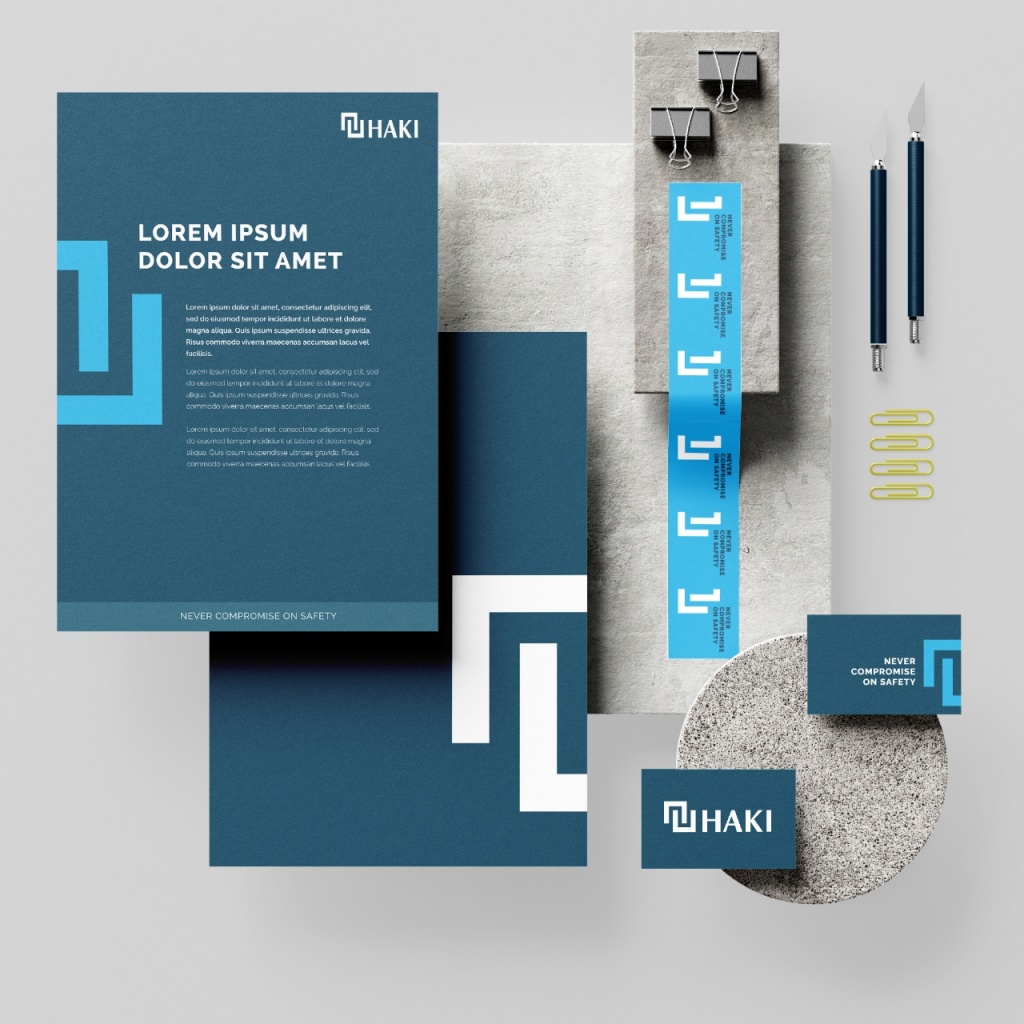
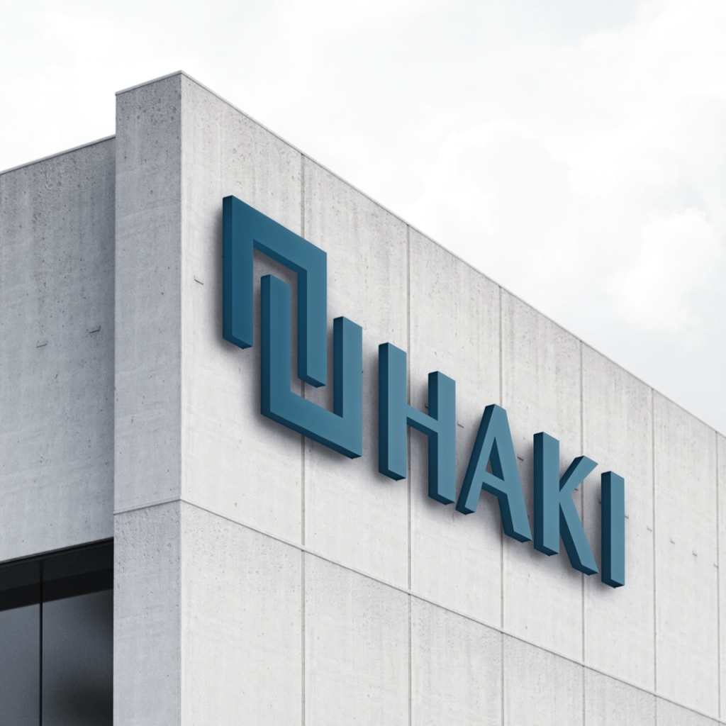
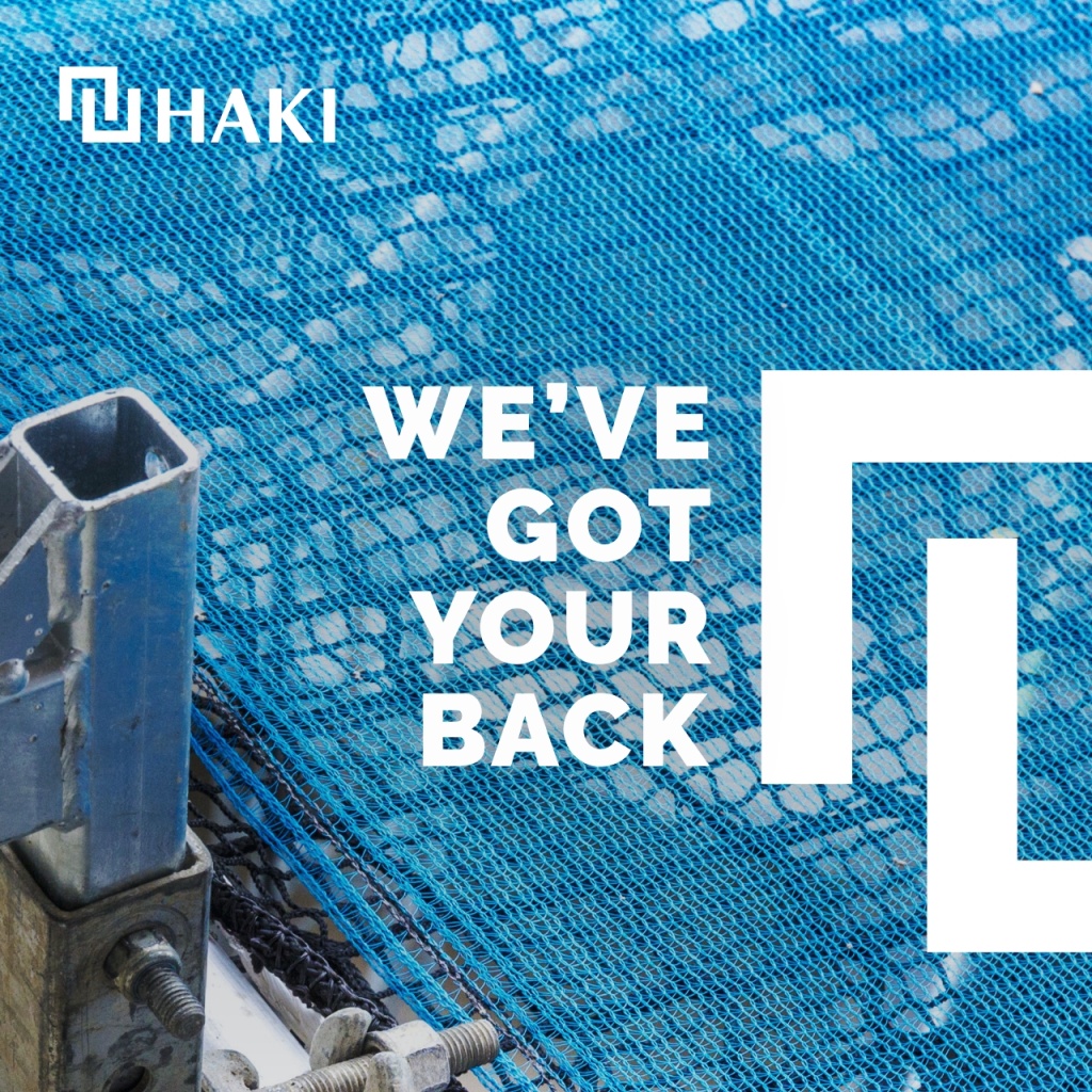
New logo and symbol
We simplified the HAKI logo in both its colour and angles but kept a part of the typography that added character. The shape language of the new logo is inspired by the innovative hook mechanism that is the foundation of the HAKI scaffolding system.
The main graphic element is a cropped HAKI logo. It can be used a brand representative symbol or to create an anchor for text.
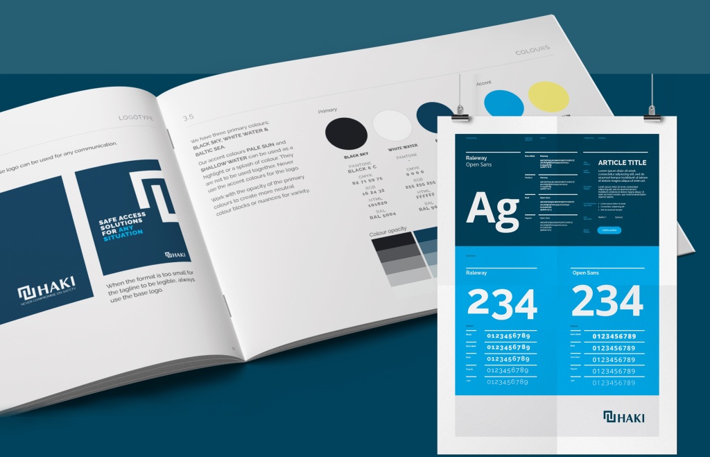
Colours inspired by wild weather
HAKI has a proud history of keeping people safe even in the harshest weather conditions. That came to be the foundation for a new colour palette. We named the primary colours The Baltic Sea, Black Sky, and White Water. The two contrasting accent colours are Pale Sun and Shallow Water.

Personality and tone of voice
A well-crafted tonality is key to both brand consistency and brand recognition. That’s why we dedicated a chapter in the brand book to tonality, focusing on both tone of voice and visual communication.
After getting to know HAKI, we settled on four characteristics that best describe who they are: confident, trustworthy, helpful, and driven. These characteristics should come across in everything they communicate.
KAN has achieved tremendous success in the endeavour to modernise our brand, all the while demonstrating profound respect for our extensive history. You skillfully anchored us in the future without compromising our essence. Collaborating with you is consistently seamless, characterised by tailored solutions and a highly proficient team that masters every aspect.”
Curious to know more? Contact me.