ZeroNorthEn route to make global trade green
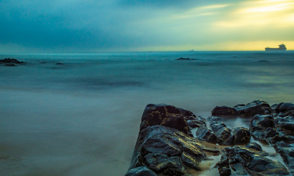
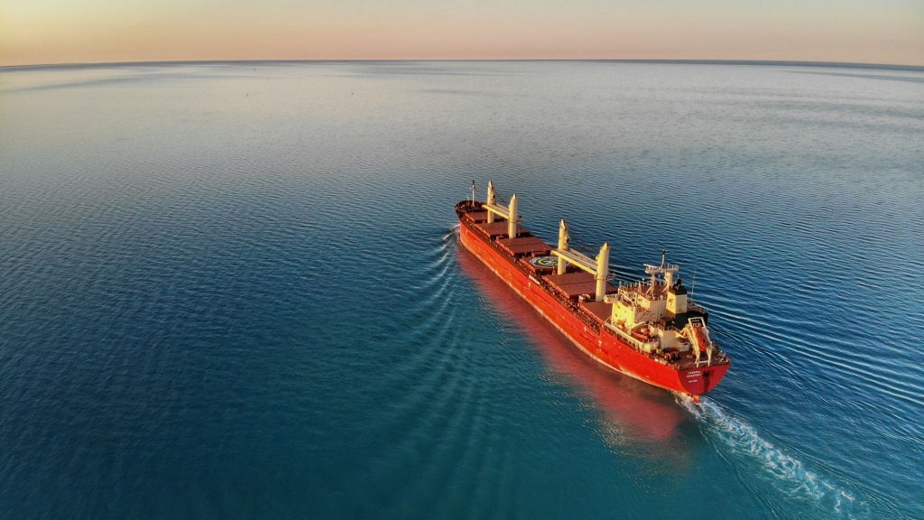
Maersk Tankers’ digital spin-off ZeroNorth was founded with a mission to lead the green transition of global trade. By making its innovative digital service available to the entire industry, the company helps vessel owners and managers operate their vessels more efficiently to reduce CO2 emissions and boost earnings.
ZeroNorth take voyage, vessel, and bunker optimisation towards a greener direction by determining the optimal speed of each vessel using several data points, such as market rates, bunker prices, weather, and individual performance.
The work we create
”
Plotting a course for the environment
When KAN teamed up with the team at ZeroNorth, the company was equipped with a strong idea, a dedicated team and the first generation of their product. However, they needed to establish a brand to support their inspiring ambition.
We started off by helping to set the strategic foundation by digging through the roots of the company, finding its pure purpose. Taking our efficient branding process into play, we helped formulate the vision, expressed the brand purpose, and fortified the values – all serving as vital parts of the brand and our first deliverable – the brand platform.
We know where we are going! Forward.
With the brand platform as foundation, coming up with a name for the brand was the next major task. We wanted to produce a powerful name with a modern feel that symbolizes everything the company stands for. The result is ZeroNorth.
The thinking behind it? No other direction is more progressive than ZeroNorth. Looking towards ZeroNorth we find Polaris – the north star looking back at us, guiding us on our journeys.
The name has built in power and an emotional energy of going straight towards a clear goal – a green transition. At the same time is it a hint to the company’s heritage (up north) and to Maersk (and its star).
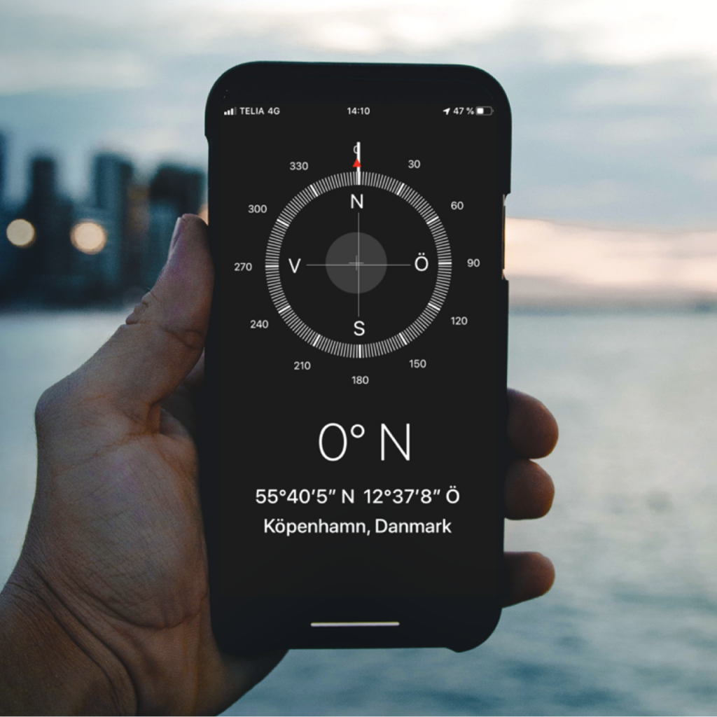
Two letters and an arrow. In one.
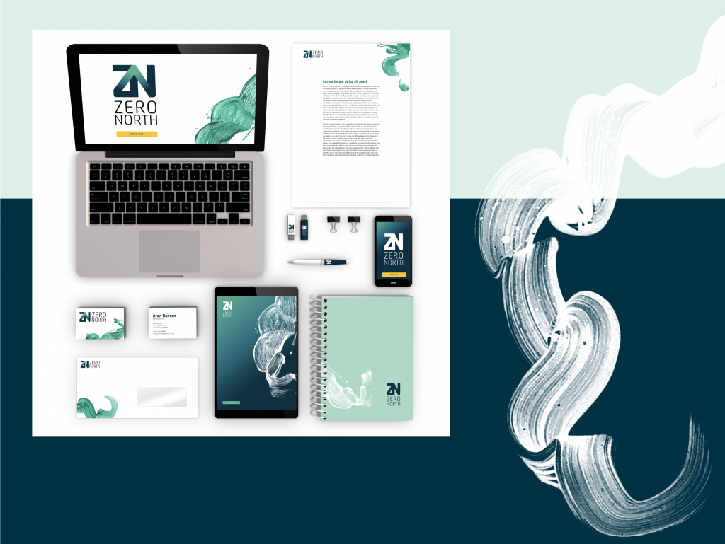
After the name passed stakeholders, legal checks, registrations etc. it was green-lighted in all instances and time for us to make the brand come alive through design. Our vision was to create a logotype with dynamic design, tailored to fit multiple applications in both digital and physical environments.
We went through many designs ranging from boats to stars. Together with ZeroNorth’s team we discussed and worked through pros and cons of design directions. We found that the answer had been staring you right in the face all the time.
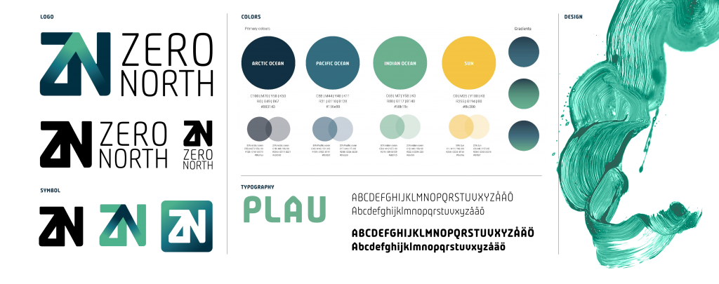
The logo consists of Zero North’s capital letters and an arrow pointing north, drawn in one single motion. It symbolizes precision, a clear direction, vision, energy, and our Nordic heritage.
A deeper connection
To balance our more rational communication, we developed a unique ZeroNorth visual pattern. This pattern is organic, energetic, and wild with a clear reference to oceans, waves, and water.

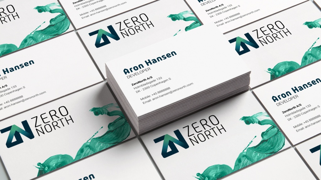
Creating a new brand isn’t always easy, but with help from KAN this process could not have gone smoother. We have ended up with a powerful identity that can live on for many years. ”
CURIOUS TO KNOW MORE? Contact me.


