KLSHonest food from Swedish farmers

KLS has been putting good food on Swedish tables for over a hundred years. They are currently the leading producer of meat products for the Swedish market, while also offering ready meals and vegetarian alternatives. The company consists of several well-known consumer brands found in supermarkets throughout Sweden, all of which are focussed on locally produced and sustainable products. KLS approached us with the realisation that they had outgrown their brand. They needed help creating a new brand to better support their ambitious goals for growth.
The work we create

”
A new name with a long history
Our first assignment was to come up with a new name. When we began the project, the company was named KLS Ugglarps, which had become a bit tricky as Ugglarps is also the name of one of their largest consumer brands.
After building a comprehensive strategy, which included defining what values should make up the core of the new brand, we landed on the name KLS. For a company with such a strong connection to its history and roots, it felt natural to keep the initials of the original name from 1908 – Kalmar Läns Slakteri (Kalmar County Slaughterhouse).
Changing to a new corporate brand was my first assignment as new Communications Director at KLS. A major assignment with a clear goal – to create a robust, long-term platform to build upon, communicatively. KAN provided a beautiful cooperation that laid the groundwork for our brand platform, which now permeates all our communication – both internal and external – and which we continue to build upon.”
Making room for growth
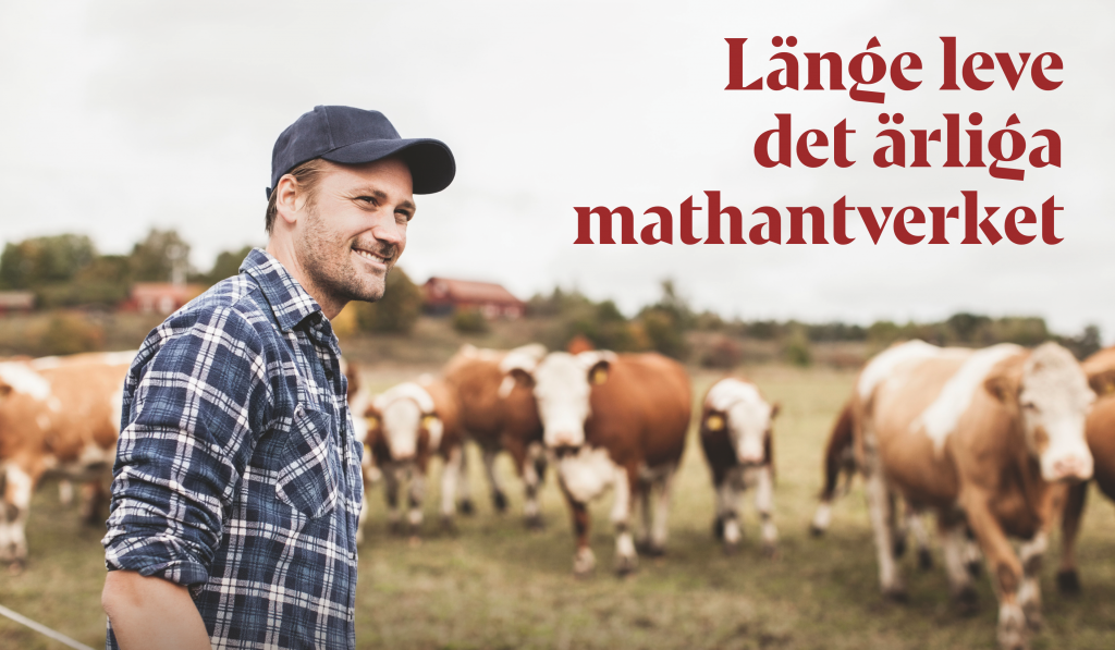
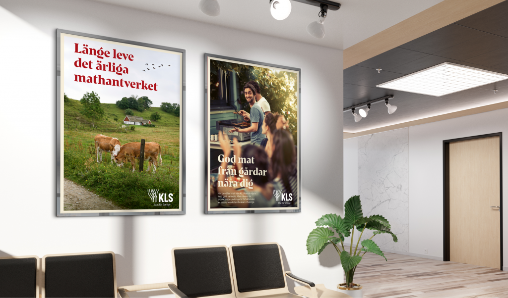
We delivered a complete brand platform consisting of a mission, vision, purpose, core values, character and brand story. KLS’s new tagline “Food for Sweden” conveys an important message and presents a clear picture of what the company stands for. We also created a new visual identity that reflects where KLS comes from, where they are today and where they are headed.
Upwards and forwards
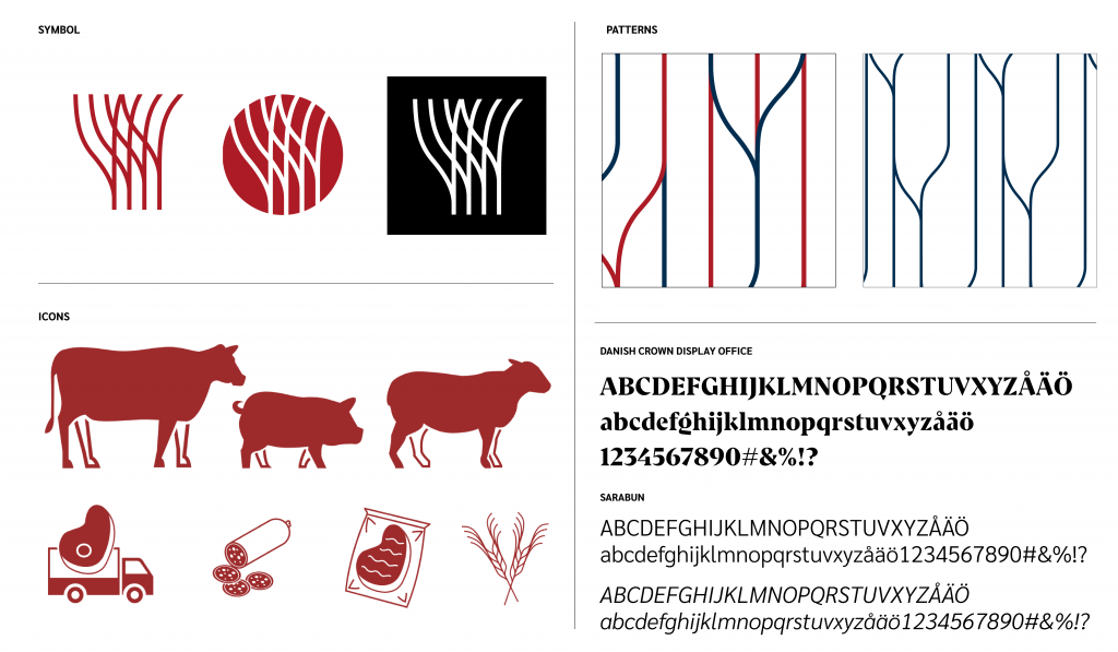
The new logo is fitting of a confident and professional parent brand on a growth journey. It combines an open and friendly symbol with three powerful letters and has an energy that is directed upwards and forwards. In the symbol, you can see cultivated landscapes, crops blowing in the wind, and tractor tracks.
”
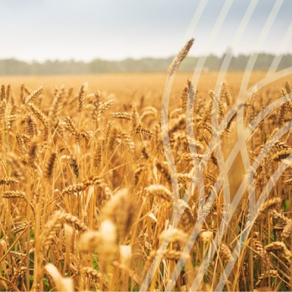
Through our development of the symbol, two additional graphic elements organically took form – a line and a pattern. The line can be used to add soft movement and life to a design, while the pattern should be used as a background element to create interest and energy.
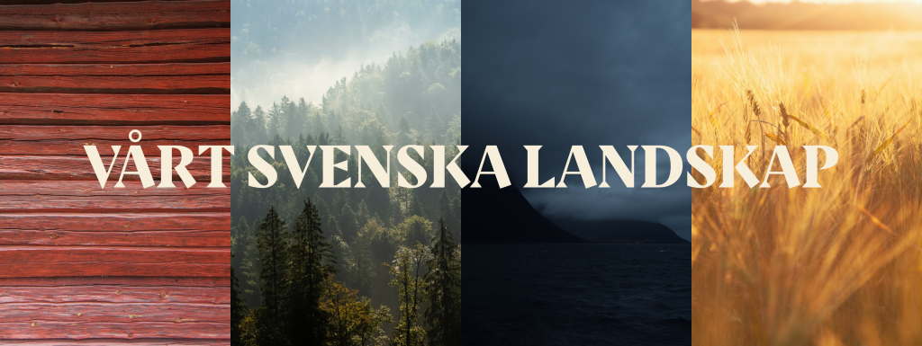
We found our inspiration for the new color palette in the rich tones of the southern Swedish landscape. The red barns, open fields, wild weather, and breathtaking nature.
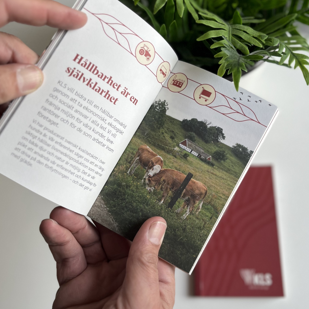
A down-to-earth guide to KLS
– and the perfect bite
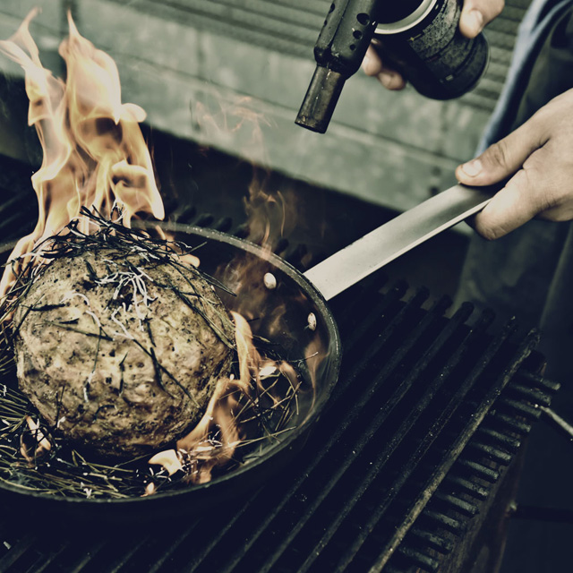
Before launching, we created a book using the new graphic profile and filled it with information, inspiration and tips for the benefit of KLS employees, partners, customers and potential recruits. The spread includes extracts from the brand platform, stories from KLS co-workers, and a practical guide for cooking different kinds of meat. The book’s purpose was to make it as easy as possible for a diverse audience to get to know KLS.
Curious to learn more? Contact me.