Kahn PedersenLaw for Digital and Public Affairs
The lawyer agency Kahn Pedersen helps its clients plan, structure, and realize business deals within and between the ever-changing “Digital” and “Public” fields.
The work we create

”
Kahn Pedersen felt that neither their visual identity nor their website mirrored their business or how they wanted the company to be perceived by clients and potential employees. So, they turned to us for help.

With the Brand as a Starting Point
We started the project by getting to know and understand Kahn Pedersen’s brand – its vision & mission, market position, identity, personality, and target audiences. We realized that business law is not only about setting the framework for good business but also about exploring the limitations and the possibilities within the framework.
The Concept is Born
Based on these insights, we developed the communication concept “Boundaries & Beyond”. The concept is based on the importance of understanding the given framework’s limitations and possibilities in every situation – because when you have an in-depth understanding of a challenge, you can find new ways to close business deals successfully.
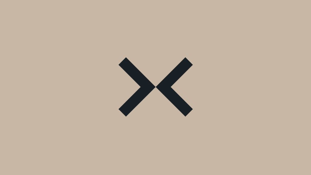
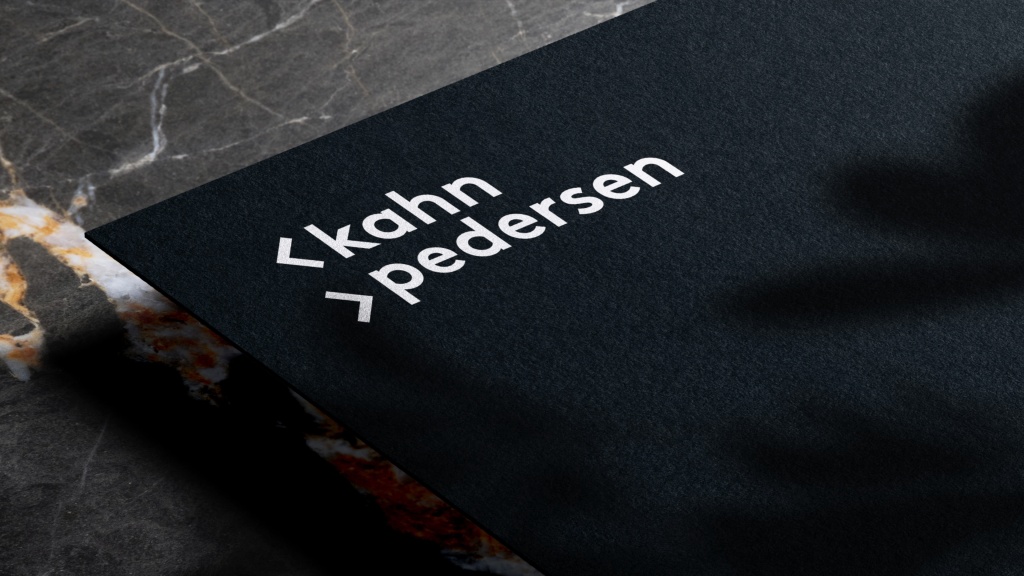
We visualized this duality with the help of the graphic elements ‹ ›. They symbolize the framework. By twisting, turning and combining the elements, we show that something that appears static can actually be flexible and dynamic – just like business law.
The communication concept with the framework was then developed into visual and text concepts that can be used in different ways and various settings.
A New Visual Identity
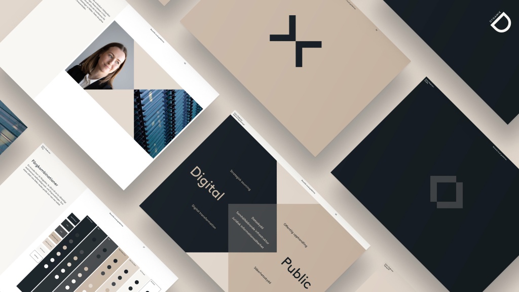
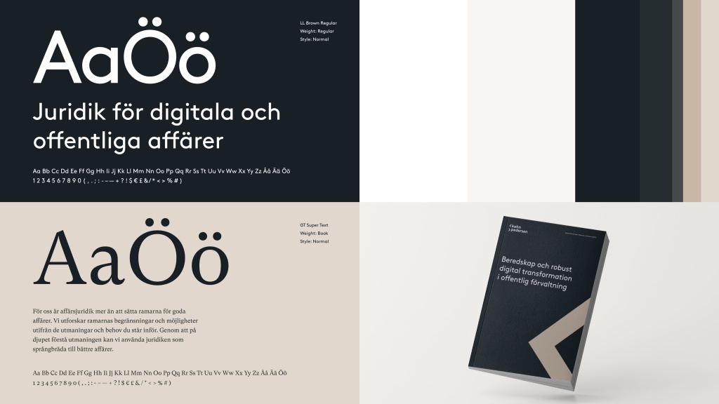
Kahn Pedersen’s four value words, depth, integrity, dynamism and care, are at the core of the new visual identity we developed.
The extended color palette stretches from black to white, creating both uniformity and flexibility. The black and white gives clarity, sharpness, and dynamism, while more neutral complementary colors can be used to create a softer framing.
Just as in the color palette, dynamism and contrast are also central elements for the fonts. LL Brown gives the headlines a modern expression, while the more traditional GT Super Text is used in the body text.
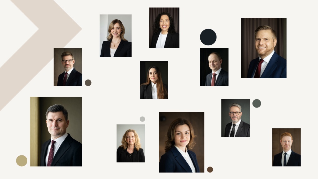
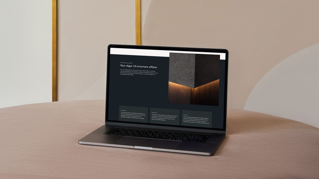
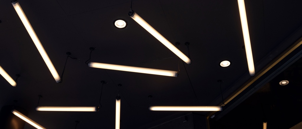
The image style is an essential part of the identity and tonality in communication. Kahn Pedersen’s new image style aspires to incorporate warmth, colors, and natural lighting in the images. The colors of, for example, clothes and textiles can preferably harmonize with the color palette.
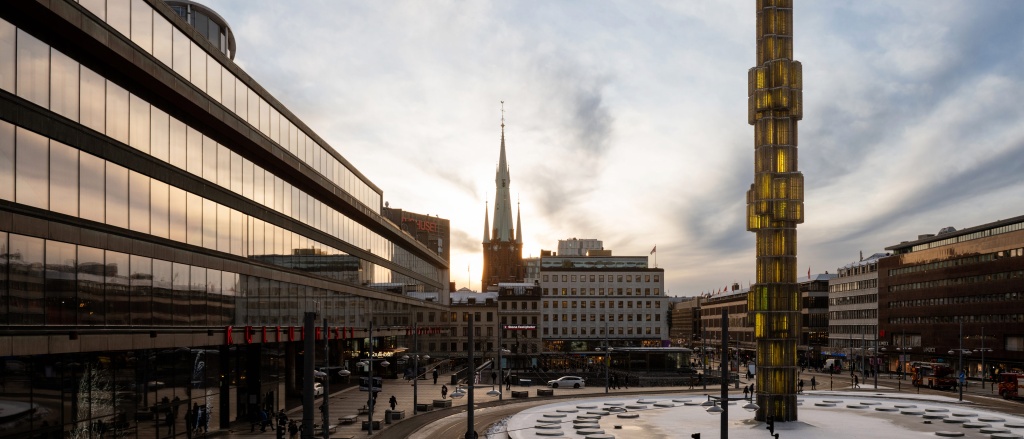
In the image style guidelines, we have also included choosing angles that make the motif interesting and mirror the communication concept framework. We also helped Kahn Pedersen photograph their employees and exterior environment.

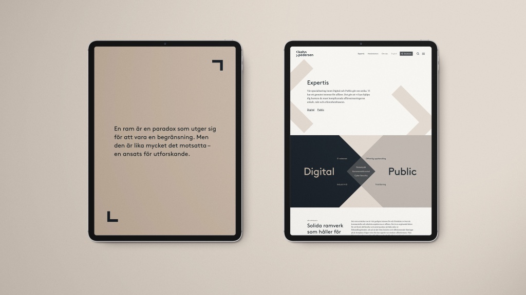
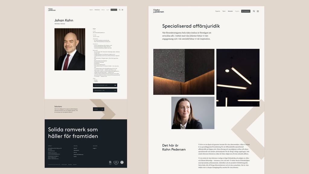
The New Website
The new communication concept and the visual identity, including the new image style, were then poured into a new website. Together with the client, we started to define the goals and purpose of the new website and developed an overarching concept.
For the CMS (Content Management System), we chose Craft since we agreed that it offers the flexibility, user-friendliness, and security we wanted.
The result? A modern, dynamic, and responsive website that is both informative and engaging – while also communicating the credibility, expertise, and integrity that Kahn Pedersen embodies.
We are very happy with the results of our collaboration with KAN. The new visual identity and website mirror how we want our clients to perceive us: friendly, skilled, and personal.”
Curious to know more? Contact me.